Registration Form: A Complete Guide to Designing, Implementing, and Optimizing Your Sign-Up Experience

A practical guide to creating user-friendly registration forms that convert, from design to implementation and optimization.
Registration forms sit at the front door of your product. A smooth, clear, and fast signup experience not only gathers essential data but also sets the tone for user trust. This guide covers best practices for designing, implementing, and optimizing registration forms so they work for your users and your business.
One-page vs. multi-step registration - pros and cons
| Aspect | One-page pros | One-page cons | Multi-step pros | Multi-step cons |
|---|---|---|---|---|
| Speed perception | Fast initial feel | Longer form on a single screen | Focused steps reduce cognitive load | More perceived steps |
| Completion rate | Potentially lower drop-off midway | All fields visible at once | Higher completion through milestones | More navigation clicks |
| Data quality | All fields visible for context | Can be overwhelming | Guided flow improves accuracy | Breaks context between steps |
| Error handling | Inline hints spread across form | Error banner late in page load | Step-by-step validation | Revisit previous steps for fixes |
| Implementation | Simpler UI | Complex state management on long forms | Modular, scalable | More pages/requests |
Compiled November 2026; check the provider's site for current details.
What makes a registration form work
Registration forms should minimize effort while collecting enough information to create a usable account. Key factors include:
- Clarity: Clear labels, expectations, and error messages.
- Efficiency: Only request information that is necessary at signup.
- Accessibility: Keyboard navigable, screen-reader friendly, and color-contrast aware.
- Feedback: Real-time validation and meaningful progress indicators.
- Security: Perceived and actual security through trusted UI cues and proper handling of data.
When you balance these elements, you increase completion rates and set a positive first impression.
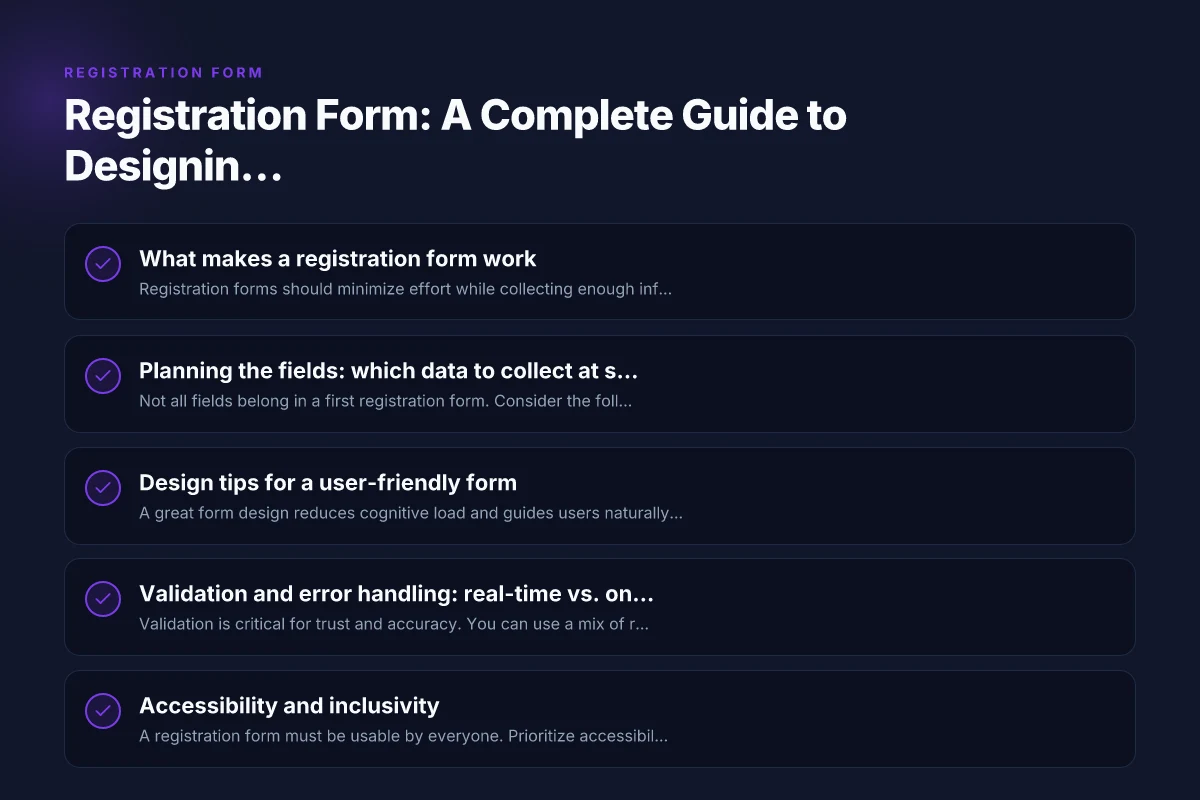
Planning the fields: which data to collect at signup
Not all fields belong in a first registration form. Consider the following approach:
- Essential fields: Email, password, confirm password (optional), first name, and a consent checkbox if needed.
- Optional or progressive disclosure: Company name, phone number, address, date of birth. These can be collected later or after initial signup.
- Smart defaults and hints: Use placeholder text and inline help to clarify password requirements, email format, and username rules.
- Optional social sign-in: Provide alternatives like Sign up with Google or Apple to speed up the process, while keeping your own data governance in mind.
A practical approach is to categorize fields into required, optional, and progressive. This helps you design a clean form and reduces user fatigue. Registration Confirmation: What It Is, Why It Matters, and How to Handle It
Design tips for a user-friendly form
A great form design reduces cognitive load and guides users naturally through the process. Consider these strategies:
- Layout: One column, left-aligned labels, and logical grouping of related fields.
- Field width and grouping: Group related fields in sections (Account details, Personal information, Communications preferences).
- Visual cues: Use a progress indicator for multi-step forms and clear action buttons.
- Field constraints: Use input masks where helpful (phone, date) and set sensible character limits.
- Microcopy: Provide concise guidance near each field (e.g., “At least 8 characters,” “We’ll never share your email without consent.”)
- Password handling: Show strength meters, offer visibility toggle, and enforce robust but user-friendly requirements.
- Error messaging: Place errors near the offending field with actionable guidance.
A clean, deliberate design reduces abandonments and helps users feel confident about submitting.
Validation and error handling: real-time vs. on-submit
Validation is critical for trust and accuracy. You can use a mix of real-time and on-submit validation:
- Real-time validation: Immediate feedback as users type (email format, password strength, required fields).
- On-submit validation: Final checks before submission, ensuring cross-field consistency (passwords match, terms accepted).
- Accessible error messages: Use ARIA attributes and screen-reader-friendly text. Highlight the field and provide a concise explanation.
- Preventive patterns: Don’t block entry for minor typos after they’ve begun typing. Offer a quick correction suggestion when appropriate.
Also, ensure you have server-side validation as a safety net. Client-side validation improves speed and responsiveness but cannot be trusted alone. Prices discount spanish classes san cristobal
Validation strategies - real-time vs. on-submit
| Validation type | Real-time feedback | On-submit only | User impact | Performance considerations |
|---|---|---|---|---|
| Field validation timing | As user types or blurs | After submit | Quicker correction, instant guidance | Higher client processing; can feel noisy |
| Error messaging | Immediate inline hints | Summary after submit | Clear next actions | Fewer interruptions mid-fill |
| Required fields | Enforced live | Enforced on submit | Early guidance on blanks | Possibly delayed feedback |
| Data integrity | Immediate format checks | Batch checks | Early quality signals | Fewer server calls upfront |
| Accessibility | Helpful for screen readers | Less proactive | Inclusive if done well | Must ensure accessible prompts |
Compiled November 2026; check the provider's site for current details.
Accessibility and inclusivity
A registration form must be usable by everyone. Prioritize accessibility from the start:
- Keyboard navigation: Ensure all fields and buttons are reachable via tab order.
- Labels and controls: Each input has a visible label, and controls have descriptive names.
- Color and contrast: Sufficient contrast for text and interactive elements. Do not rely on color alone to convey information.
- Error accessibility: Screen readers announce errors with clear, contextual messages.
- Mobile accessibility: Touch targets are large enough, and responsive layout adapts to small screens.
Accessibility isn’t a one-off task. It’s an ongoing commitment that pays dividends in reach and compliance. Photo Gallery San Cristobal Chiapas: A Visual Guide to the City’s Best Images
Security and privacy considerations
Users share sensitive information during signup, so security matters:
- Password storage: Hash and salt passwords using strong algorithms (e.g., bcrypt, Argon2).
- Data minimization: Collect only what you truly need at signup. Offer settings to provide more later.
- Transport security: Use TLS for all data in transit, with HSTS enabled.
- CSRF protection: Implement tokens to prevent cross-site request forgery.
- Privacy by design: Be transparent about data usage, provide easy access to privacy controls, and comply with relevant regulations (GDPR, CCPA, etc.).
- Verification steps: Optional email or phone verification can improve account security and data quality.
Communicate your security measures in plain language to reassure users without overwhelming them with jargon.
A practical comparison: one-page vs. multi-step registration
| Criterion | One-page sign-up | Multi-step sign-up |
|---|---|---|
| Completion speed (average) | Usually faster for simple forms | May feel slower but improves perceived progress for long forms |
| Cognitive load | Higher if many fields are shown at once | Spreads fields across steps, reducing overwhelm |
| Error handling | Might require scanning a long list of errors | Isolated to the current step, easier to fix |
| Data quality | Often sufficient for minimal data | Can request validated data progressively |
| Marketing integration | Easier to implement single field capture | Can space out offers and improve engagement per step |
A one-page form can be ideal for short sign-ups, while a well-designed multi-step flow helps if you need to collect more information or guide users through a staged onboarding. Use data and user testing to decide which path fits your product and audience.
Implementing a robust registration form: technical tips
- Use semantic HTML: Labels tied to inputs, proper fieldset and legend usage for groupings.
- Client-side validation: Lightweight JavaScript validation for instant feedback, but never rely on it exclusively.
- Debounce checks: When validating fields like email against a server list, debounce requests to avoid flooding your API.
- Password policies: Implement strong client-side checks but enforce policies server-side to prevent circumvention.
- Form submission behavior: Disable the submit button while processing, show a spinner, and provide a clear success message or redirect.
- Anti-spam measures: Implement rate limiting, CAPTCHA alternatives like invisible reCAPTCHA, or email verification.
- Data handling: Sanitize inputs, escape outputs, and validate on the server to prevent injection attacks.
- Progressive enhancement: The form should be functional with JavaScript disabled (to a reasonable extent) or at least gracefully degrade.
A well-structured implementation reduces errors and makes maintenance easier as your product evolves. Newsletter: how to start, grow, and optimize a compelling newsletter
Accessibility and inclusivity considerations - checklist
| Criterion | Examples / indicators | Yes / No / Partial | Implementation notes |
|---|---|---|---|
| Keyboard navigation | Tab order logical | Yes | Ensure focus moves predictably |
| Screen reader support | ARIA labels, roles | Yes | Describe fields and errors accurately |
| Color contrast | Sufficient contrast | Yes | Test with accessibility tools |
| Field labeling | Clear, visible labels | Yes | Use placeholders as secondary |
| Error accessibility | Announced errors | Yes | Live region for errors |
| Inclusive field options | Diverse gender, optional fields | Partial | Allow custom inputs, optional demographics |
| Time to complete | Reasonable length | Yes | Break into steps if long |
| Language clarity | Plain terms | Yes | Avoid jargon |
Compiled November 2026; check the provider's site for current details.
In-app onboarding and post-signup considerations
Registration is just the first step. Turn sign-ups into successful onboarding with:
- Welcome flow: A brief, friendly welcome message and a quick tour or checklist.
- Email verification: If used, provide clear steps and a friendly re-verification path if needed.
- Identity setup: Offer a guided setup for profile completeness, preferences, and notification settings.
- Trust signals: Show security badges, terms of service, and privacy policy access readily.
- Next actions: Clear CTAs for what to do after sign-up (create a first project, connect a payment method, etc.).
A thoughtful onboarding helps users realize value quickly, increasing long-term retention. Medical spanish course Mexico san cristobal chiapas
The final recommendation: balance speed with data quality
- Start with a lean, two-step or single-page form for core fields (email, password, name).
- Provide optional fields or progressive disclosure for richer profiles.
- Implement real-time validation, accessible error messages, and clear success feedback.
- Prioritize accessibility, security, and privacy from day one.
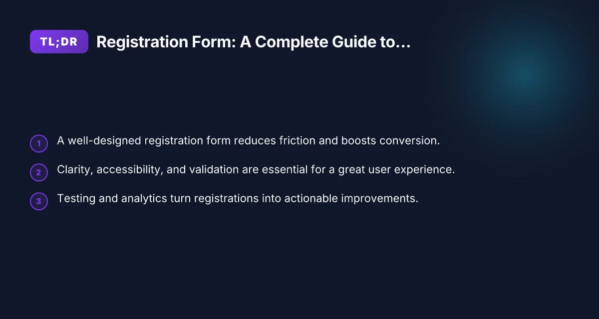
- Use analytics to measure drop-offs at each step and run iterative tests to optimize your form and onboarding flow.
If you’re unsure where to start, begin with a minimal viable signup form, then gradually add fields and features as you validate user needs and observe behavior.
In short, a well-crafted registration form is more than a set of inputs. It’s a carefully designed entry point that blends usability, accessibility, and security to welcome users and convert interest into lasting engagement. Start with clarity and speed, protect user data, and continuously test and refine to keep your signup experience strong.