Dummy text: what it is, where it comes from, and how to use it
A practical guide to dummy text, its origins, uses in design, and tips for choosing the right filler content.
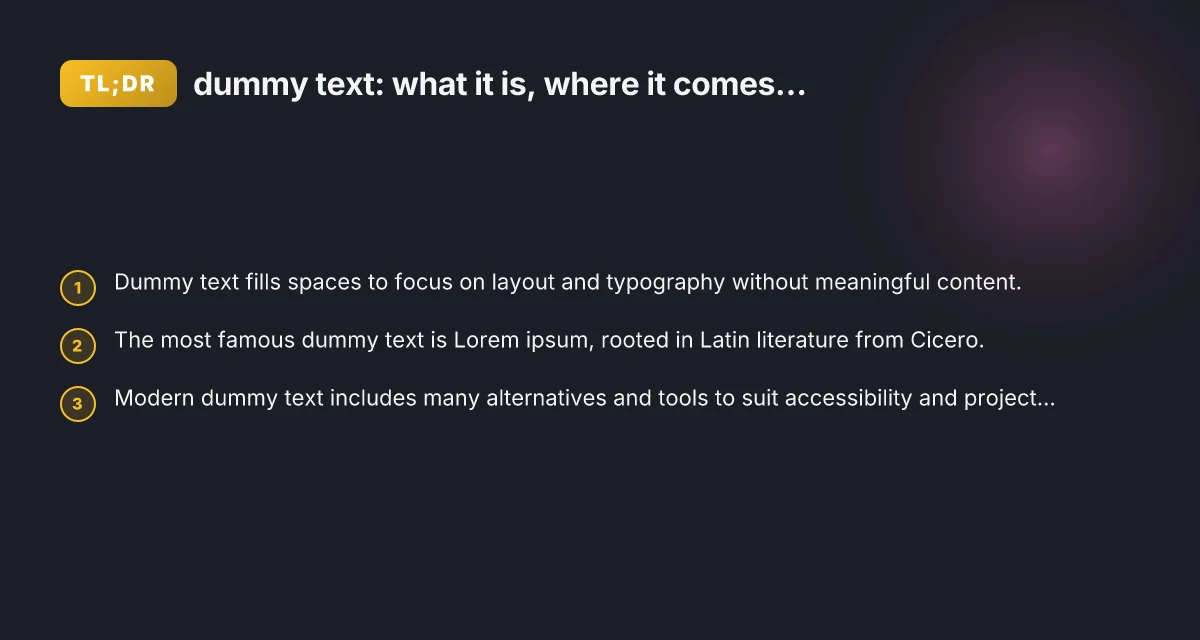
Dummy text is a practical tool designers and developers rely on to visualize how a page will look before real content is ready. It isn’t meant to be read. Its purpose is to mimic the rhythm, length, and distribution of words and sentences. By using placeholder text, you can assess typography, spacing, color, and layout without the distraction of meaningful content. This article unpacks what dummy text is, where it comes from, and how to use it effectively in various projects.
Comparison of dummy text purposes and relevance
| Purpose | When to use | Benefit | Common pitfalls | Examples | Notes |
|---|---|---|---|---|---|
| Placeholder for layout | Early design stages | Visual structure preview | Can mislead stakeholders | Lorem ipsum, domain placeholders | Use as interim only |
| Content planning | Content strategy drafts | Aligns with tone and length | May not reflect real content | Short headlines, brief paragraphs | Pair with real copy later |
| Accessibility checks | Accessibility testing | Ensures text flow and read order | Silent visuals if empty | Screen reader tests with filler | Test with real length variations |
Compiled November 2026; check the provider's site for current details.
What is dummy text and why it matters
Dummy text, also called placeholder text, is non-informational content used to fill a space. It helps teams:
- Evaluate typography: font choice, line length, and readability.
- Test layout: margins, grids, and alignment without real content.
- Communicate progress: stakeholders can see structure without waiting for copy.
- Maintain focus: reduces analysis paralysis during early design stages.
Some projects can technically proceed with real content. Dummy text accelerates iteration cycles. It’s a swiss army knife for designers, developers, and content strategists who want to separate form from function enough to test visuals early.
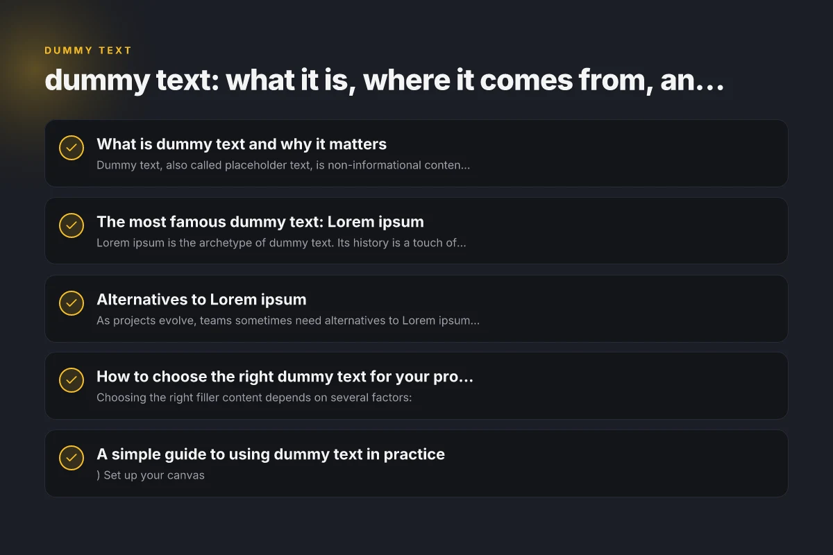
The most famous dummy text: Lorem ipsum
Lorem ipsum is the archetype of dummy text. Its history is a touch of design lore:
- Origins: It’s derived from a Latin text by Cicero, written over 2,000 years ago.
- Purpose: It was scrambled and adapted in the 1500s by typesetters to create a block of text with a natural distribution of letters.
- Why it endures: Its letter frequency and rhythm resemble readable English, yet it’s nonsensical, which prevents readers from getting distracted by meaning.
Using Lorem ipsum remains popular because it provides a believable textual texture that doesn’t resemble English prose closely enough to reveal content prematurely. It’s also widely supported by design tools and templates, making it a dependable default. Courses you can take to level up your skills in 2024 and beyond
Alternatives to Lorem ipsum
As projects evolve, teams sometimes need alternatives to Lorem ipsum to better reflect tone, language, or accessibility considerations. Here are common options:
- Content-aware placeholders: Text blocks with generic but readable content relevant to the project domain (e.g., “Product summary goes here.”).
- Richer dummy text: Paragraphs that demonstrate specific typographic features (longer sentences, varied punctuation, lists).
- Non-Latin placeholders: Languages like Cyrillic, Greek, or Asian scripts to test multi-language layouts.
- Semantic placeholders: Use actual dummy data that aligns with the product (e.g., fake user names, product descriptions) to better preview real-world use.
- Accessible placeholders: Text that remains readable by screen readers and does not degrade accessibility testing if the project will be translated or localized.
When selecting an alternative, consider the project’s audience, the languages involved, and whether you want to simulate real-world content length and style.
How to choose the right dummy text for your project
Choosing the right filler content depends on several factors:
- Language and localization: If your site ships in multiple languages, use placeholders that reflect the target languages to test text direction, glyphs, and line height.
- Content length and structure: If your page features short intro blocks and long body text, mix short and long placeholders to accurately mimic real layouts.
- Accessibility and inclusivity: Ensure the dummy content doesn’t encode problematic terms or cultural references. Prefer neutral, inclusive text.
- Typography goals: Different fonts handle spacing and punctuation in unique ways. Test with placeholder text that emphasizes the font’s strengths and weaknesses.
- Collaboration needs: Teams may benefit from using placeholders that resemble the actual content’s tone, such as product microcopy or UI labels.
A practical approach is to start with Lorem ipsum for quick layout checks, then swap in more domain-appropriate filler before stakeholder reviews. Contactanos: how to reach Spanish-speaking support and what to expect
A simple guide to using dummy text in practice
- Set up your canvas
- Create a rough wireframe or mockup canvas with consistent margins and grid systems.
- Choose consistent line lengths to reflect your intended typography.
- Apply placeholder blocks
- Use paragraphs of varying lengths to simulate real content.
- Include headers, subheaders, bullet lists, and callouts to test typographic hierarchy.
- Test readability and rhythm
- Check line length: aim for 50-75 characters per line for comfortable reading.
- Vary sentence length to emulate natural pacing.
- Include bullets or numbered lists to verify spacing and alignment.
- Consider color and emphasis
- Use neutral placeholder text color to avoid biasing perception.
- If your design relies on emphasis (bold, italics, quotes), mirror that with the dummy text.
- Review with stakeholders
- Gather feedback on layout and visual balance rather than content meaning.
- Note any areas where real content might require adjustments (e.g., shorter headlines or longer product descriptions).
- Prepare for handoff
- When real content arrives, replace placeholders in a controlled pass, preserving layout constraints.
- Document where content was intentionally truncated or shortened so copywriters and engineers align.
Criteria to choose the right dummy text for a project
| Criterion | Lorem ipsum | Domain-specific placeholders | Custom generic text | Nonsense filler | Readability considerations | Collaboration impact |
|---|---|---|---|---|---|---|
| Semantic relevance | low | medium to high | varied | none | important | high |
| Length control | good | good | variable | fixed | important | moderate |
| Accessibility friendliness | neutral | positive when labeled | depends on text | problematic | critical | high |
| Brand alignment | no | yes with labels | limited | no | yes for tone | high |
| Generation effort | easy | moderate | moderate | easy | depends | moderate |
Compiled November 2026; check the provider's site for current details.
A quick comparison: Lorem ipsum vs domain-specific placeholders
| Feature | Lorem ipsum | Domain-specific placeholders | Accessibility considerations |
|---|---|---|---|
| Purpose | Quick layout testing; neutral text | Realistic tone and structure for a domain | Must remain readable by screen readers; avoid jargon that obscures layout |
| Typical length | Varied, flexible | Mirrors expected content length | Use consistent density to avoid layout flips |
| Language/locale | Latin-like; not readable | Fits target language or multilingual needs | Prefer neutral or translated placeholders when testing UX |
| Realism | Moderate | High realism for faster stakeholder alignment | Ensure placeholders don’t encode sensitive info |
Using this table can help your team decide whether Lorem ipsum suffices or you need domain-specific placeholder text for better fidelity.
How to generate dummy text efficiently
- Built-in tools: Many design platforms include placeholder text generators or plugins that insert Lorem ipsum blocks with a click.
- Custom templates: Create reusable snippets for headers, body text, captions, and UI copy to speed up iterations.
- Scripting: Simple scripts can auto-generate randomized phrases or domain-relevant placeholders to cover edge cases.
- Localized placeholders: If you’re shipping in multiple languages, prepare language-specific filler blocks to test translation workflows.
Tips for efficiency Contact US fr
- Keep a consistent style in your placeholders to avoid misinterpretation about tone.
- Use placeholders that reflect expected content density so you don’t over- or under-fill sections.
- Archive and version placeholders alongside design files, so you can reproduce layouts with the same filler across revisions.
Final section: recommendation for best practice
If you’re new to dummy text, start with Lorem ipsum to establish a baseline for typography and layout. As your project matures, tailor placeholders to your audience and design goals:
- For multinational projects, include placeholders in the target languages to test directionality and typographic behavior.
- For content-heavy sites, mix longer and shorter blocks, headlines, and lists to replicate real content flow.
- For accessibility-focused work, ensure that the placeholder text does not obscure navigational elements or help text and remains legible across different contrast settings.
In short, dummy text is a practical, time-saving tool that helps you iteratively refine design without waiting for finished content. Use it thoughtfully, evolve beyond the classic Lorem ipsum when necessary, and always align placeholder strategy with your project’s language, accessibility, and content goals.